Building the core experience of Community Leaders
A design refresh to support the acquisition efforts of SariSuki
YEAR
2021 (6 months)
GOAL
To recreate the CL app and fix design debt from the old app
ROLE
In charge of research, design, copywriting, and testing of the app
IMPACT
Background
When I came in as the Founding Designer, there was already a version of the CL app that was built and used by Community Leaders. Community Leaders are online sellers that sell fresh produce, and grocery items through SariSuki. We supply them all the items and when they sell to their customers, they get a commission.
The app is used for the following use cases:
The challenge
The app was designed and built by the CTO and a full stack engineer. It is functional; however, it had a lot of UX issues which the team was aware of. These affected the shopping and ordering experience of our users. As an early stage startup, traction is a priority. Therefore, it was critical to redesign the app in a way that is easy to navigate and valuable to users.
Unfortunately, our CTO left the company, which resulted to the team unable to retrieve the old app’s code and improve it. This presented a bigger responsibility on my end. I had to recreate the app and fix all UX issues fast.
Research
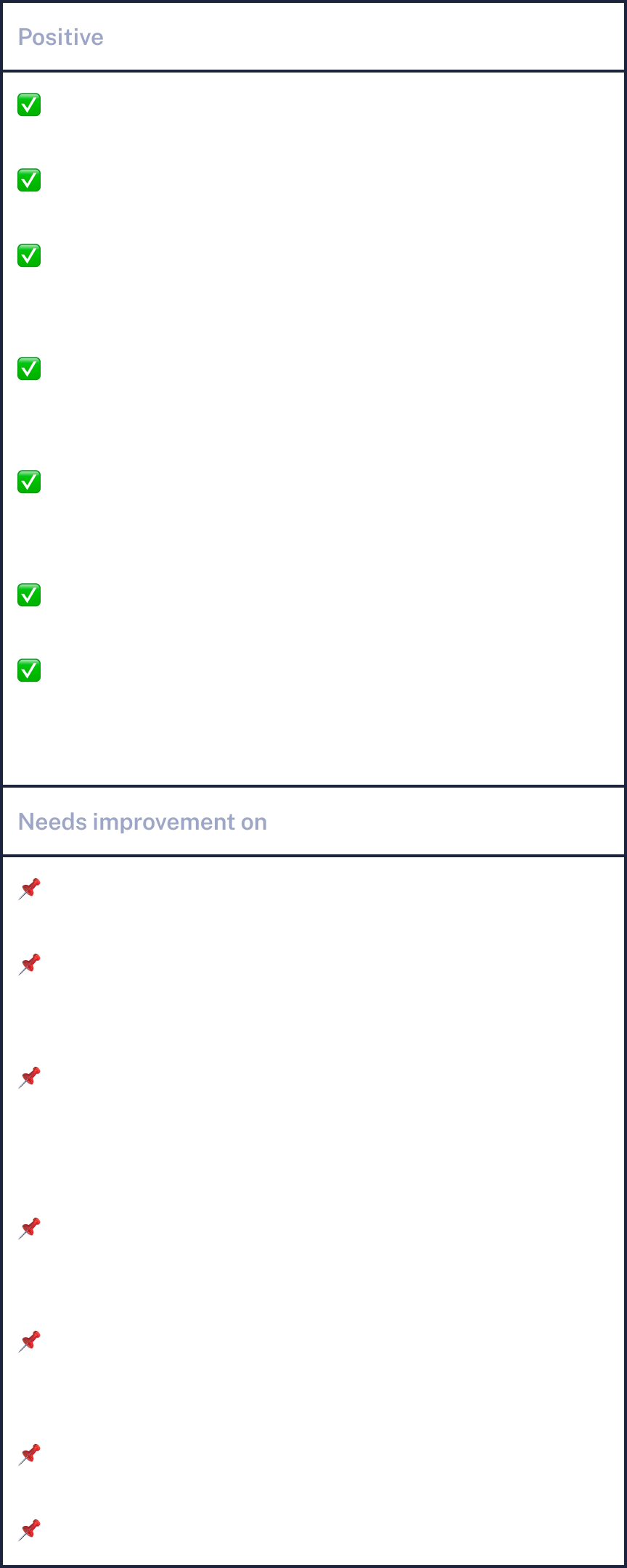
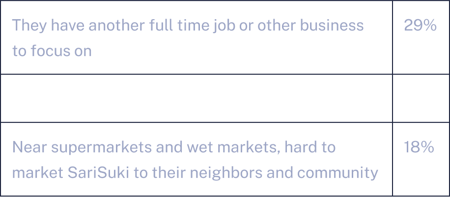
I had to identify what are the UX issues we need to fix. I called 17 community sellers who use the old app but haven’t sold anything for 2 weeks or more.
Here are the 3 top reasons why:
During the interviews, I decided to focus more on asking questions related to the learning curve. I asked the CLs what is it about the app that’s hard to understand initially. Here are some of the critical feedback they gave:

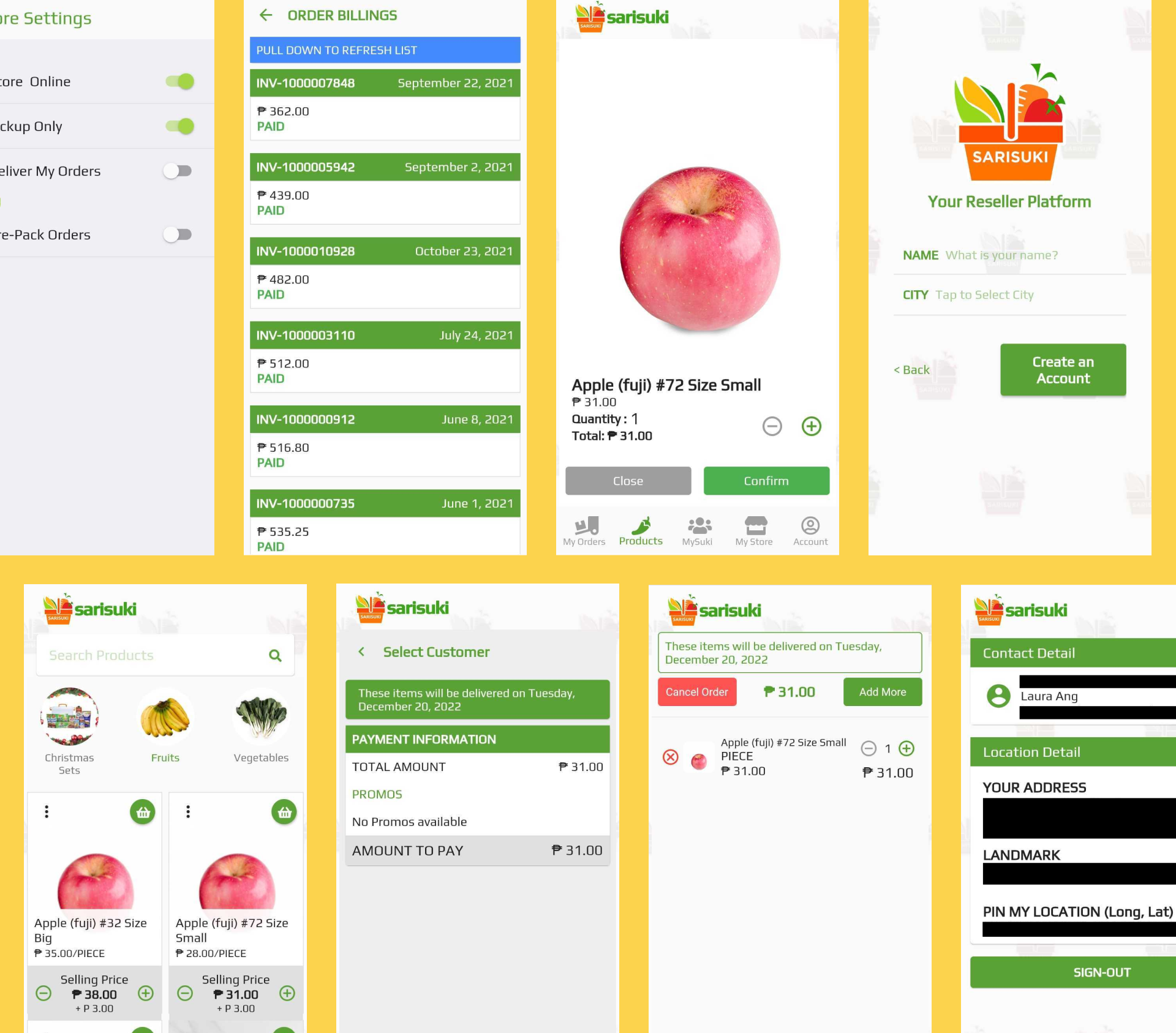
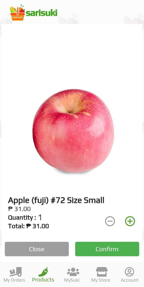
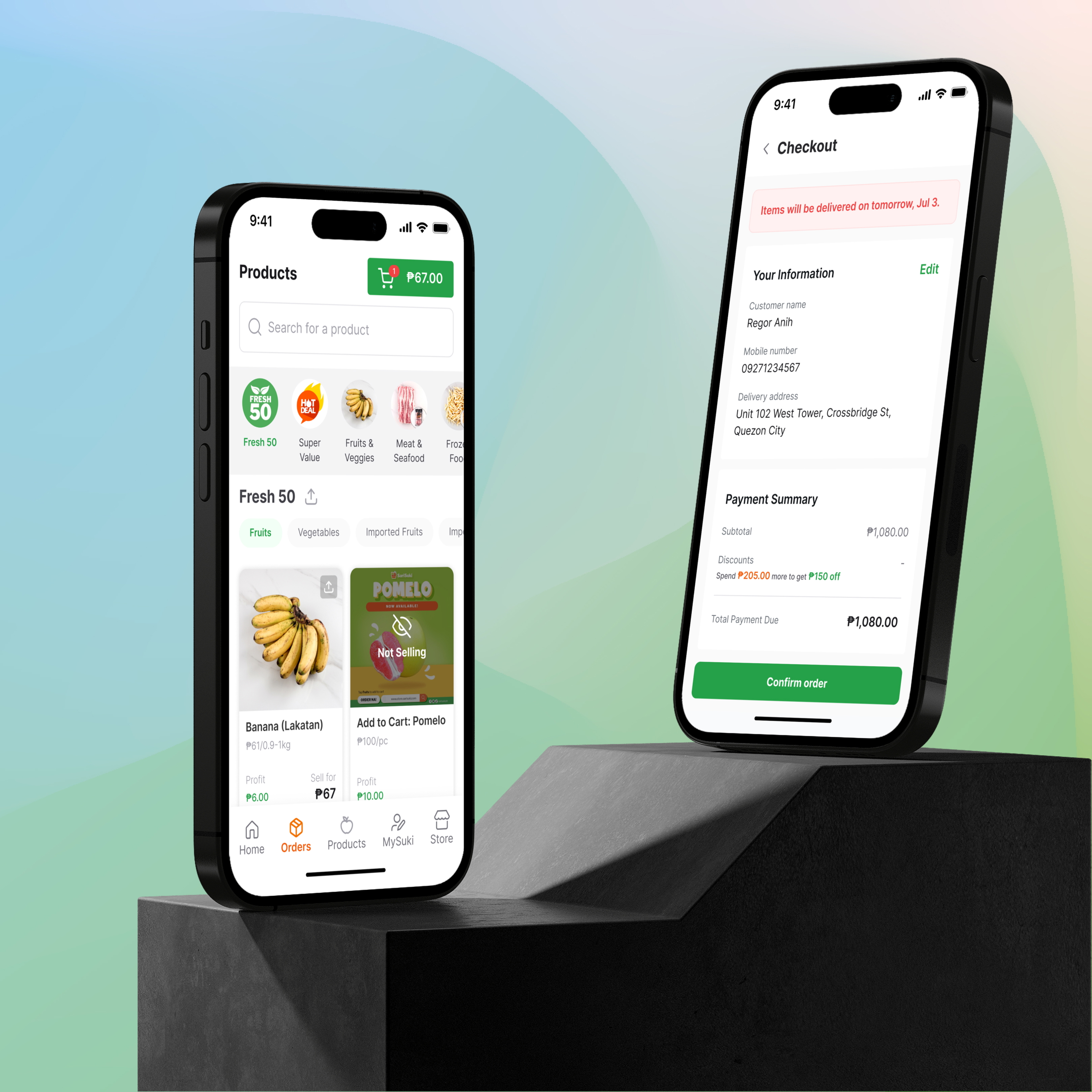
Products Page
Impact
Because CLs want to try it out for themselves first, they needed help figuring out how the products page works before they could get their first order.
I also did a heuristic evaluation of the old app to find out if there are more flows or visual elements I need to improve on.
My evaluation notes

Impact
The inconsistency and lack of design principles being followed can be overlooked if you only have a couple of users. However, SariSuki is growing rapidly. We’re hitting an average of 56% growth month on month on CL registrations. This will only lead to more confusion and frustration among our users.
My Assumptions
To move fast, I am unable to make big changes to the app. Therefore, some assumptions need to be validated after launching the new redesign:
Key implementation steps
Solution
1. Create a style guide of colors, typography scaling, grid and key components.

There was no marketing team when I started this redesign. We chose this type of green as the primary color of the brand because we want to be associated with fresh produce. As for the typeface, I chose Inter as the product’s typeface due to its readability even when applied in different sizes.
2. Ideate on how to fix the product catalogue and other key design debt in the app.
I mostly retained how the app is structured on a navigational level. I also didn’t change the Taglish language.
For the product page, I decreased the sizes of the categories to fit 4 1/2 categories. In SariSuki, we had a total of 16 categories in the old app so it was critical to let the users know that there are more.
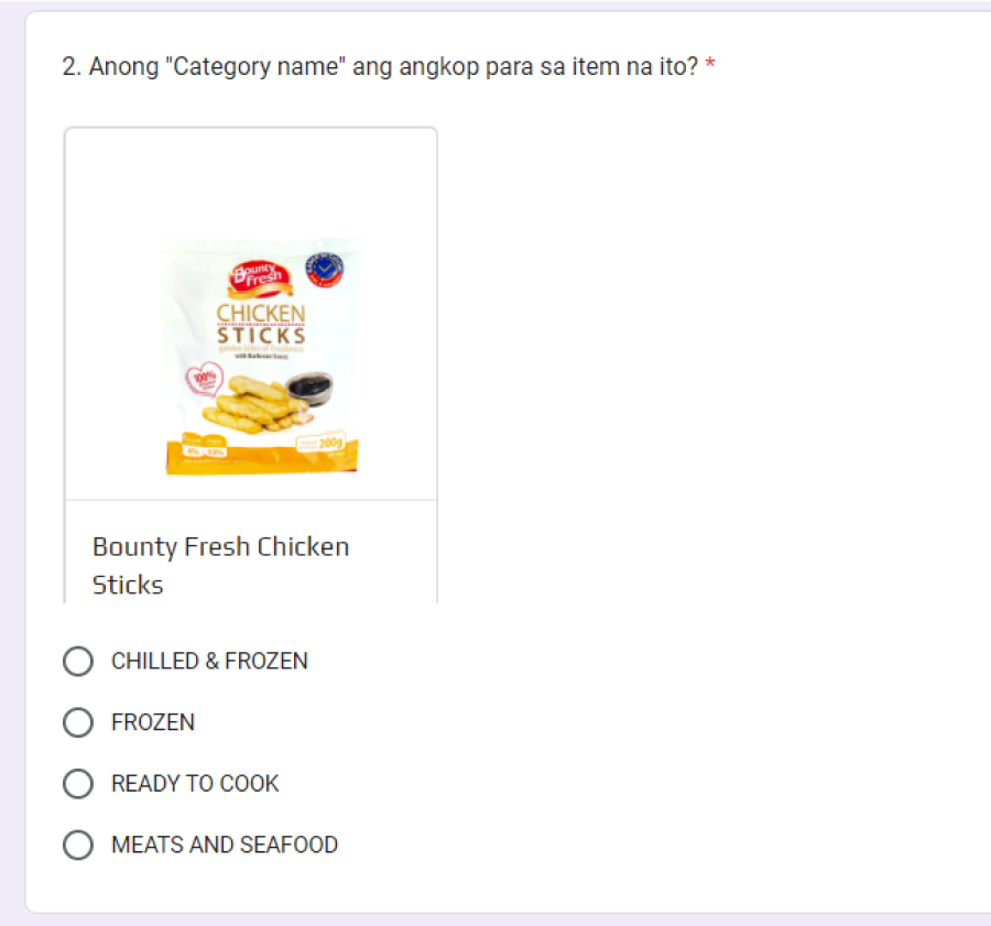

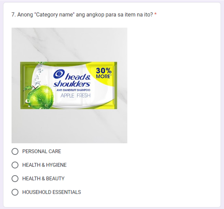
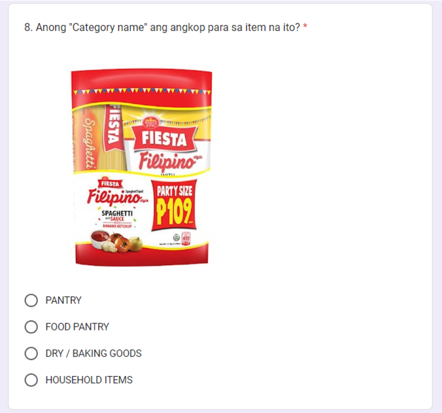
I also sent out a survey to check where the Community Leaders expect to find certain items (in terms of categories). The goal of this was to identify whether CLs understand the categorization found in the old app.
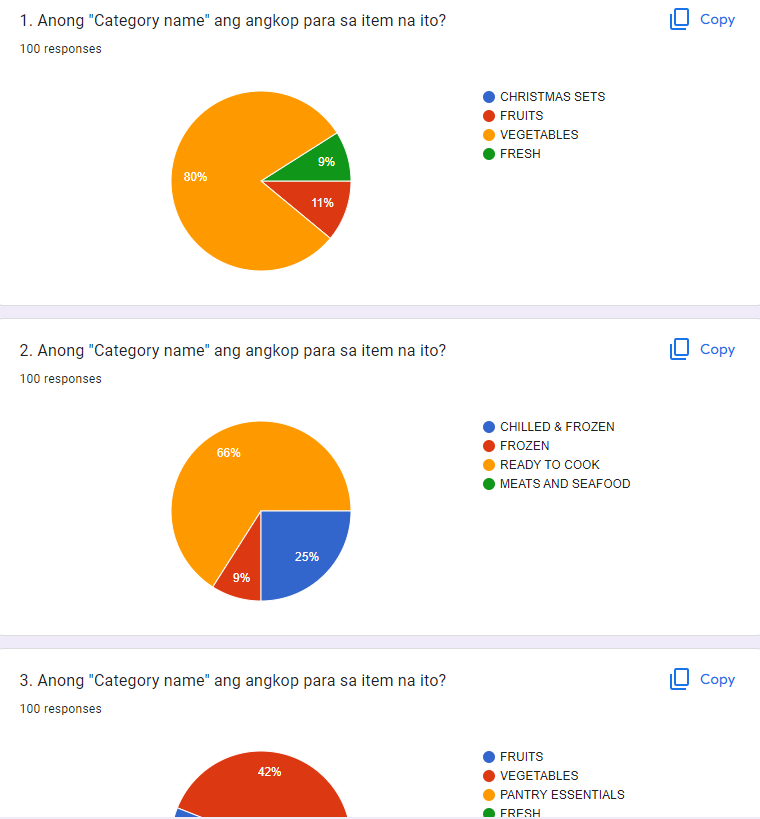
Through the help of our community team, I was able to get 100 responses from our Community Leaders.
Majority of the answers were similar to how we labeled the categories on the app. Therefore, there won’t be much change with the categorization of the catalogue itself.
Aside from the products page, I took the time to work on the design issues found in the app.

Though a big challenge, I was able to fix issues on color, visual hierarchy, contrast, and increase affordance. I’ve also made sure to include headers describing the page the user is currently in. There’s a lot more breathing room (~whitespace~) when you look at the new app.
Results
When we released this last Dec 2021, I sent out a survey to our CLs to ask about their initial experience using the new app. Here are some of the feedback we got:
Most of the critical feedback we got could be bucketed into 3 pillars:
Fortunately, before we released the new app, we were able to add data tracking so we can measure how our app is performing.
From the old app to the new app, we were able to:
It’s crucial to note here that the data presented is also influenced by our marketing and acquisition efforts.
Validating my assumptions
There are some assumptions that I was able to validate through calling some of our Community Leaders after we have launched the new app.
Next steps
Lessons Learned
1. I had to accept that my designs aren’t finished.
While working on this app, I noticed so many things that I haven’t fixed. This made me beat myself too much - thinking that I was unable to improve the app to a great extent. My manager had to talk me out of my insecurities and remind me that design is iterative. Now we have a new app, we have more work to do.
2. I enjoy being proven wrong about my assumptions and design solutions.
I also realized that unlearning what I know is an enjoyable process for me as a designer.
LET'S WORK TOGETHER
© 2023 This website is built by Laura Ang, without writing any code