
Redesigning a Loan Provider’s Landing Page
How visual design and copywriting helped improve the SecureLoan website
YEAR
2021 ( 2 months)
GOAL
To redesign the SecureLoan website and attract potential loan applicants.
ROLE
In charge of creating the style guide, redesigning the look and feel of the website, and improving how SecureLoan presents loan information
IMPACT
Background
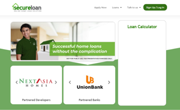
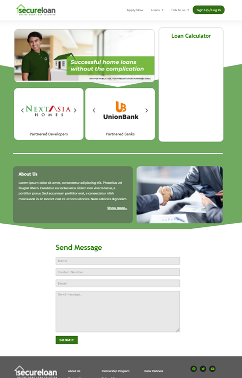
The co-founder of SecureLoan hired me to redesign their website. The photo below is their initial mockup. The team didn’t have a designer during this time. In terms of visual direction, the co-founder just used the branding deck given to them by an agency to create the design.
The goal of this website is to educate potential loan applicants on what types of loan Secureloan offers, why they should choose this loan provider, and how the process works.
The challenge
The team at SecureLoan wanted to make the website inviting, modern and informative. Since SecureLoan is a startup, the team needed their website to look good and work well so that they could get initial traction.
My task as a freelance UI/UX designer is to fix the evident design issues and make the website look attractive to scan.
The goal of this website is to educate potential loan applicants on what types of loan Secureloan offers, why they should choose this loan provider, and how the process works.
Analyzing the old website
I performed a heuristic evaluation to understand how the current site is structured and designed.
My evaluation notes
Implications to the business
Due to the design issues listed above, the current design may not be as effective when encouraging a user to apply. For a website, you have to make a good first impression to a user, not only from a visual standpoint, but from an informational aspect as well.
Key implementation steps
Solution
1. Propose a change in the colors and typeface used.
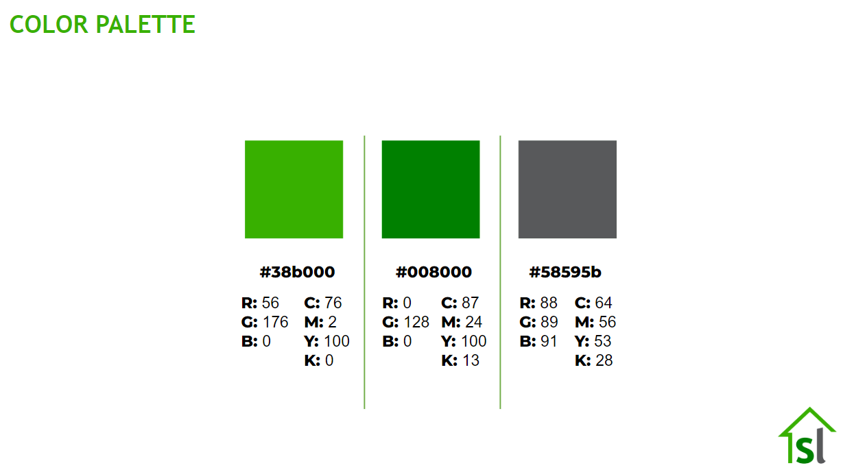

Since the branding agency only gave the team these colors, I had to create a palette that is focused on contrast and accessibility. The team also asked me to propose a secondary color to see how it would support the primary green color.
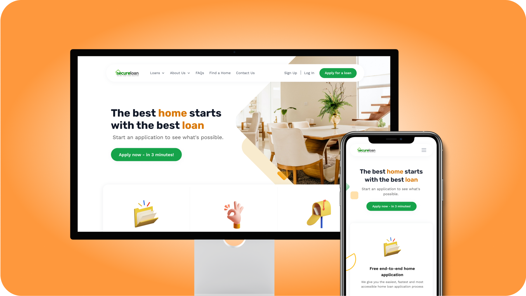
2. Fix the design issues that were found, most importantly, in the home page.
I started with some wireframes to show how we can present the content more effectively. I looked at landing pages of global competitors to understand how they communicate to their users. I showed this to the team to gather initial feedback. They didn’t have much critical feedback so I was able to move on to creating the high fidelity mockups.

3. Design the other pages and work on the copy of the website.
After getting feedback on the home page, I was able to work on the copy and design of the other pages in the website. For copy, I revised some of the headlines and subheadings to make it sound friendlier while still professional.
Results and Next Steps
The team was able to develop the website and it’s now live at https://secureloan.ph. The co-founder personally commended me saying that they didn’t think it could look this good and that the new design went beyond their expectations.
After finishing the new website, the co-founder tapped me once again and asked to redesign their customer portal to make the look consistent throughout the customer journey.
LET'S WORK TOGETHER
© 2023 This website is built by Laura Ang, without writing any code